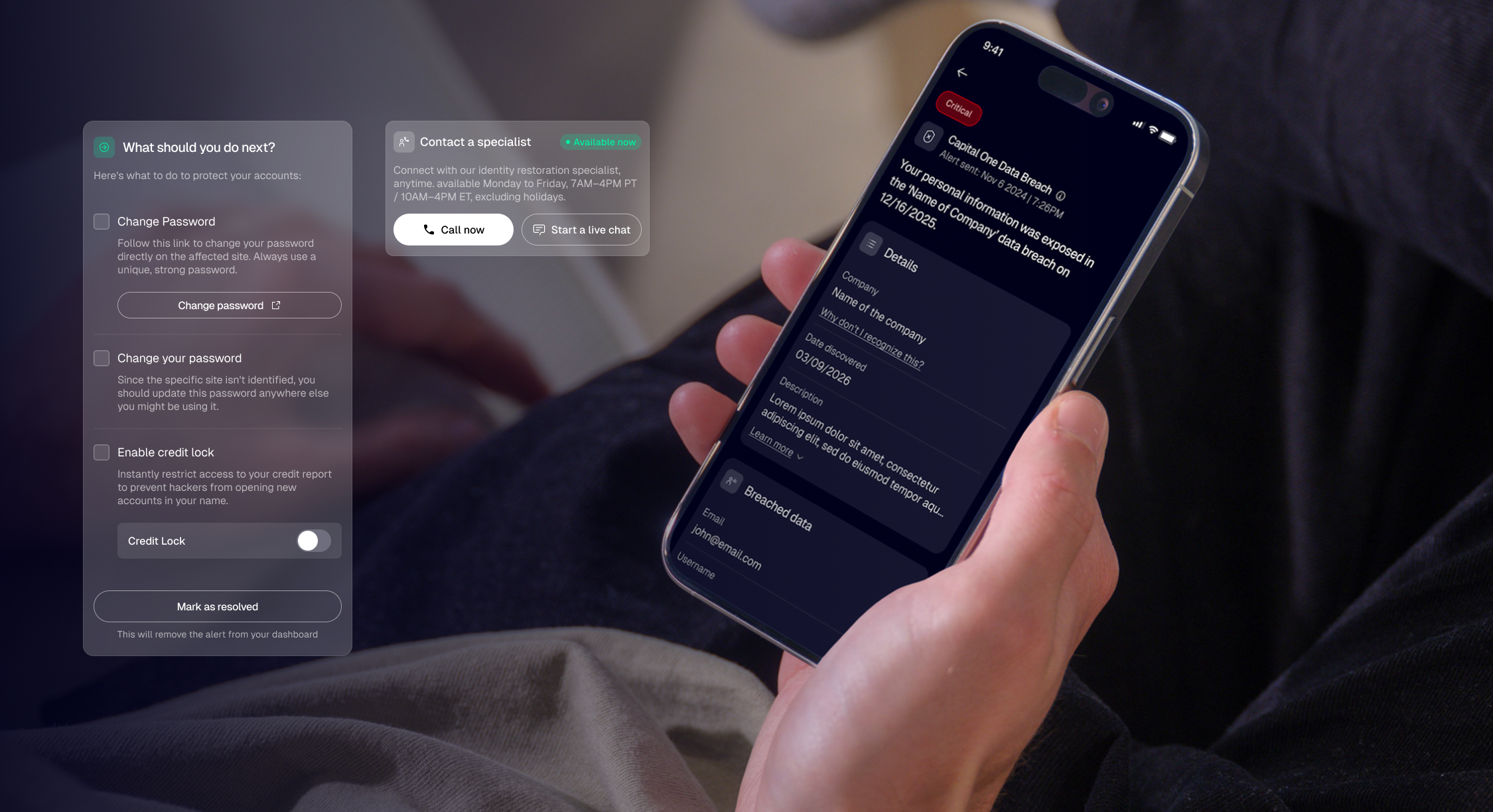
Optimizing OmniWatch's Customer Journey from Acquisition to Retention
Over more than a year, I partnered with product and marketing to continuously improve acquisition, onboarding, activation, and retention through behavioral design and experimentation, increasing conversion by 50% while improving key activation metrics.
- Client
- OmniWatch
- Role
- Strategy and Product Design
- Focus
- Growth Strategy, UX & CRO
- Industry
- Cybersecurity
- Product
- SaaS webapp & app, website, funnels
Context
OmniWatch is a subscription-based identity protection platform that helps consumers monitor their personal information, detect potential identity threats, and take action before they become serious problems.
Over more than a year, I partnered closely with the Product, Marketing, and Engineering teams to continuously improve the customer journey across acquisition, activation, onboarding, and the core product experience. Rather than working on a single redesign, my role focused on identifying the biggest barriers preventing users from understanding the product, experiencing its value, and becoming long-term customers.
Throughout the collaboration, I combined user research, behavioral design, UX strategy, and iterative experimentation to solve a series of product and growth challenges. This case study highlights the most impactful ones.
The challenges
Unlike many design projects, this collaboration wasn't centered around a single feature or redesign. Over more than a year, we continuously identified the biggest barriers preventing users from discovering, understanding, adopting, and fully trusting the product.
Rather than tackling everything at once, we approached the journey one challenge at a time. Each initiative started with a specific business or user problem, followed by research, experimentation, iterative design, and measurable improvements. The following sections highlight the five challenges that had the greatest impact on the product's evolution.
- 01 — Helping users understand why identity protection matters.
- 02 — Turning Free Scan Results into Product Value.
- 03 — Turning security into peace of mind.
- 04 — Improving Product Activation Through Onboarding.
- 05 — Making security alerts understandable and actionable.

01 — Helping users understand why identity protection matters
Most people weren't looking for an identity protection service because they didn't realize they had a problem. Before explaining why OmniWatch was the right solution, we first needed to help users understand why they needed one at all.
Description
When I joined the project, our website was primarily focused on explaining why OmniWatch was a better identity protection platform than competitors such as Aura and LifeLock. The messaging emphasized feature comparisons, insurance coverage, and product capabilities—assuming visitors already understood the value of identity protection and were evaluating different providers.
At first, I approached the redesign with the same assumption. My goal was to improve how we communicated OmniWatch's strengths and create a more compelling website experience. However, after testing early concepts with users, I realized we were solving the wrong problem.
What changed my perspective
Through user interviews and usability testing, a consistent pattern emerged. Most participants weren't comparing OmniWatch against competing identity protection services because they weren't actively looking for one. In many cases, they weren't even aware that products like OmniWatch existed. Instead, they were still trying to understand much more fundamental questions:
- — Could this actually happen to me?
- — What exactly is identity theft?
- — Won't the banks cover it?
This completely changed how I thought about the problem. Rather than competing for users already comparing identity protection platforms (a market largely dominated by established brands) we needed to educate a much broader audience that understood the risk but had never considered using a dedicated protection service.
The challenge wasn't differentiation. It was awareness.
How we responded
This insight fundamentally changed the direction of the website redesign.
Instead of leading with product features and competitive comparisons, we shifted the experience toward educating users about the problem first and the solution second. The messaging became less technical, focused more on real-world situations, and clearly explained the value of the service before asking users to evaluate its capabilities.
The redesign also introduced a stronger emotional narrative, helping visitors understand not only what OmniWatch does, but why identity protection matters in the first place.
Key learning
One of the biggest lessons I took away from this project was that customers can't evaluate your solution until they first understand their problem.
Looking back, I realized I had initially designed for users who were already familiar with identity protection services. The research challenged that assumption and completely changed the direction of the project. It reinforced the importance of validating the problem before optimizing the solution, a mindset that shaped every subsequent initiative throughout my collaboration with OmniWatch.
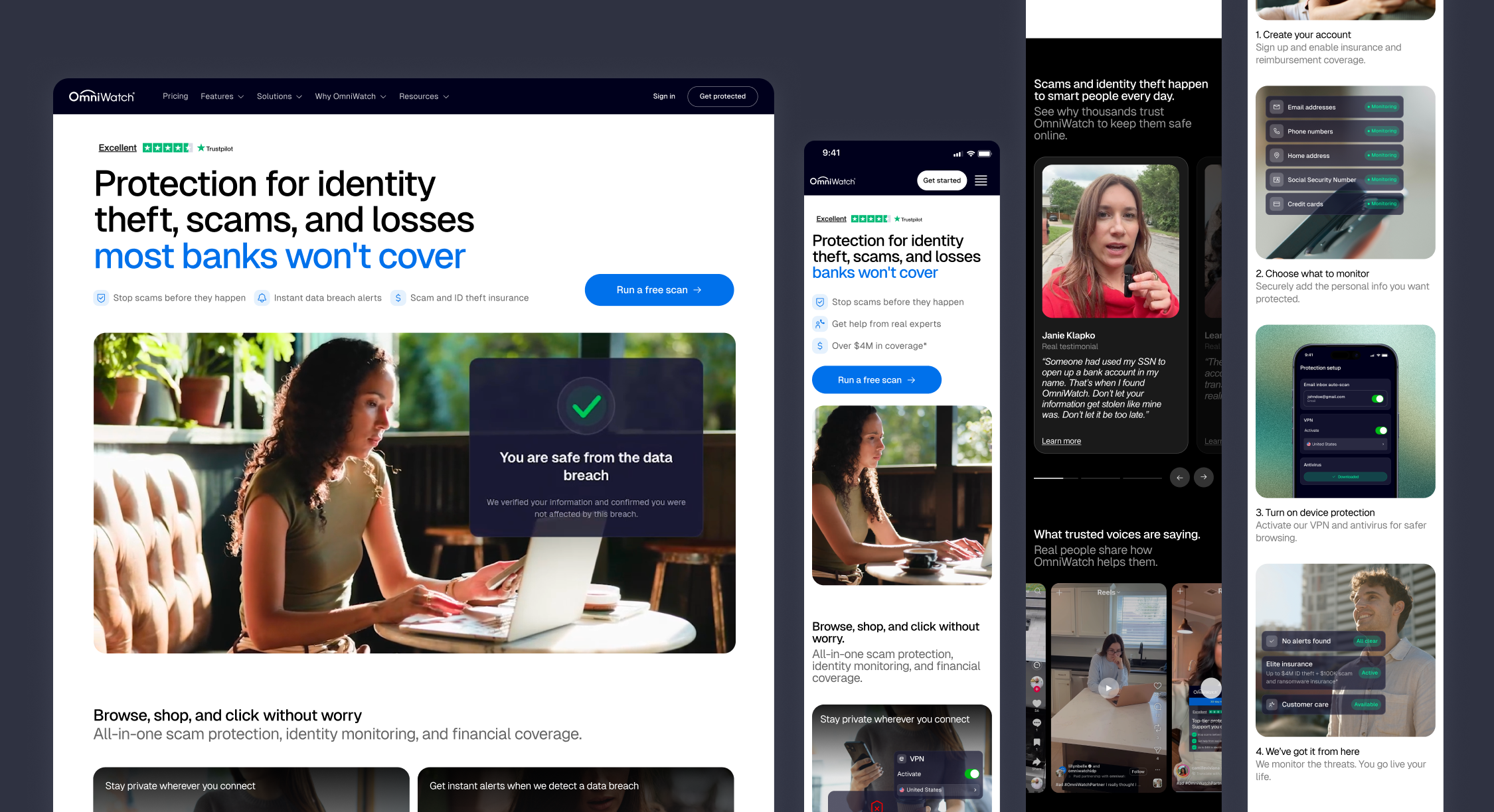
02 — Turning Free Scan Results into Product Value
We continuously refined the scan funnel, testing different approaches to improve conversion while helping users better understand the value of the service.
Description
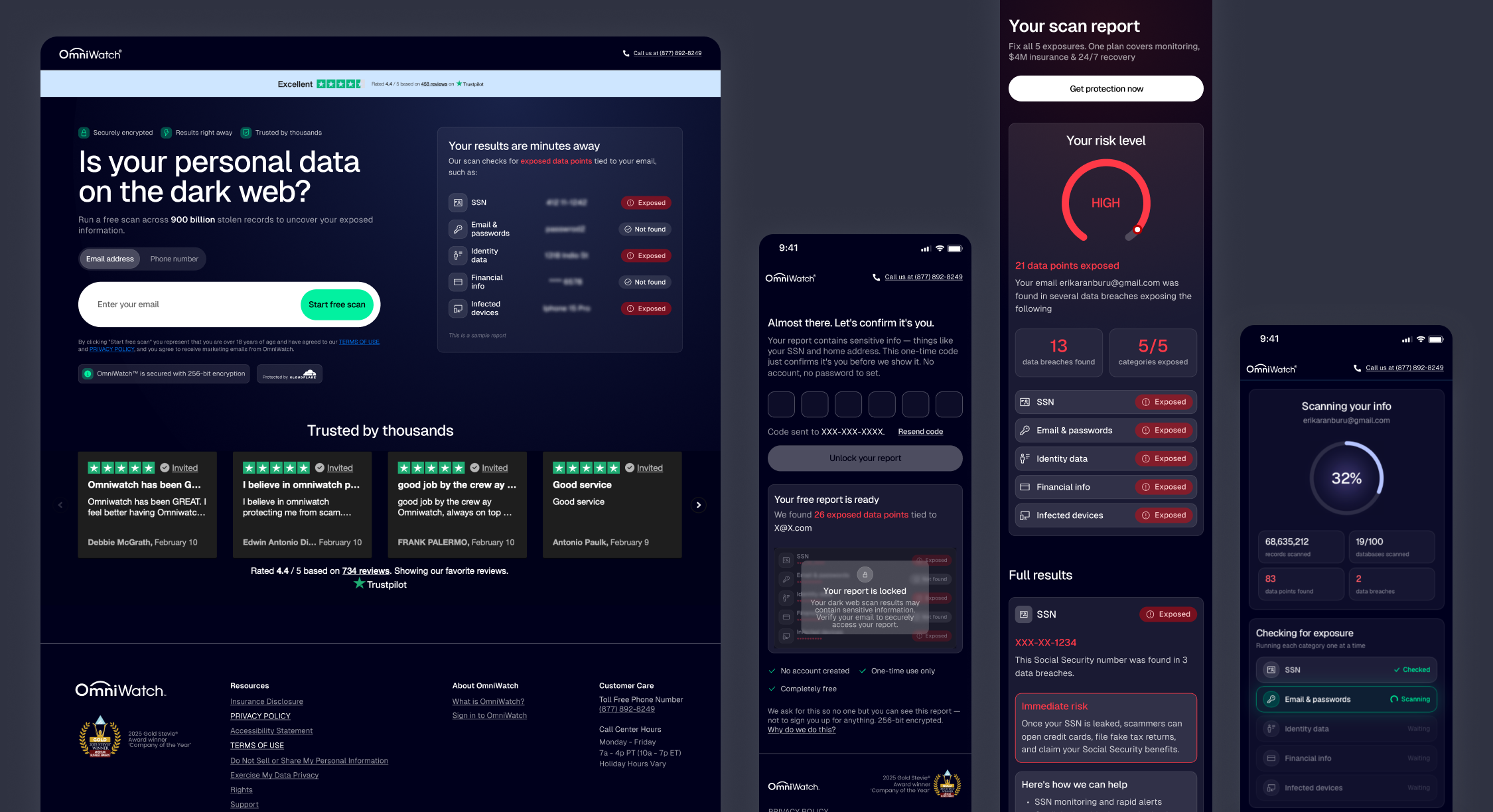
The free identity scan was the main driver of acquisition, but converting curious visitors into paying customers proved to be much more difficult.
Initially, users were asked to subscribe before seeing their specific scan results, creating a disconnect between the promise of a “free scan” and the experience itself. While moving the results before the paywall made the funnel significantly more transparent, it also revealed a new challenge: users understood what was exposed, but not why OmniWatch was worth paying for.
The problem was no longer getting users to the report, it was helping them connect their results with the value of continuous identity protection.
Learning 1: Transparency improved customer quality, not just conversion
Our original funnel encouraged users to subscribe before seeing their detailed scan results. While this approach pushed more users toward the payment step, many were subscribing simply to unlock the report—not because they understood the value of the ongoing service. As a result, a significant portion of those customers entered onboarding without a clear understanding of what they had purchased, leading to lower activation.
By revealing the scan results before the subscription, we made the experience more transparent and helped users make a more informed decision. Although fewer users continued to the verification step, those who did were significantly more likely to become paying customers. The conversion rate from report view to purchase increased from 0.29% to 0.62%, while activation also improved, indicating that we were attracting more qualified customers rather than simply generating more purchases.
Learning 2: From “I have a problem” to “this solves it”
Showing users their scan results created awareness, but many still struggled to understand why OmniWatch was worth paying for. The transition from “I have a problem” to “OmniWatch is the solution” relied too heavily on the paywall.
This insight led us to explore a more product-led approach, introducing users to the core experience before asking them to subscribe. The goal was to help users experience the product first and naturally connect their scan results with the long-term value of the service.
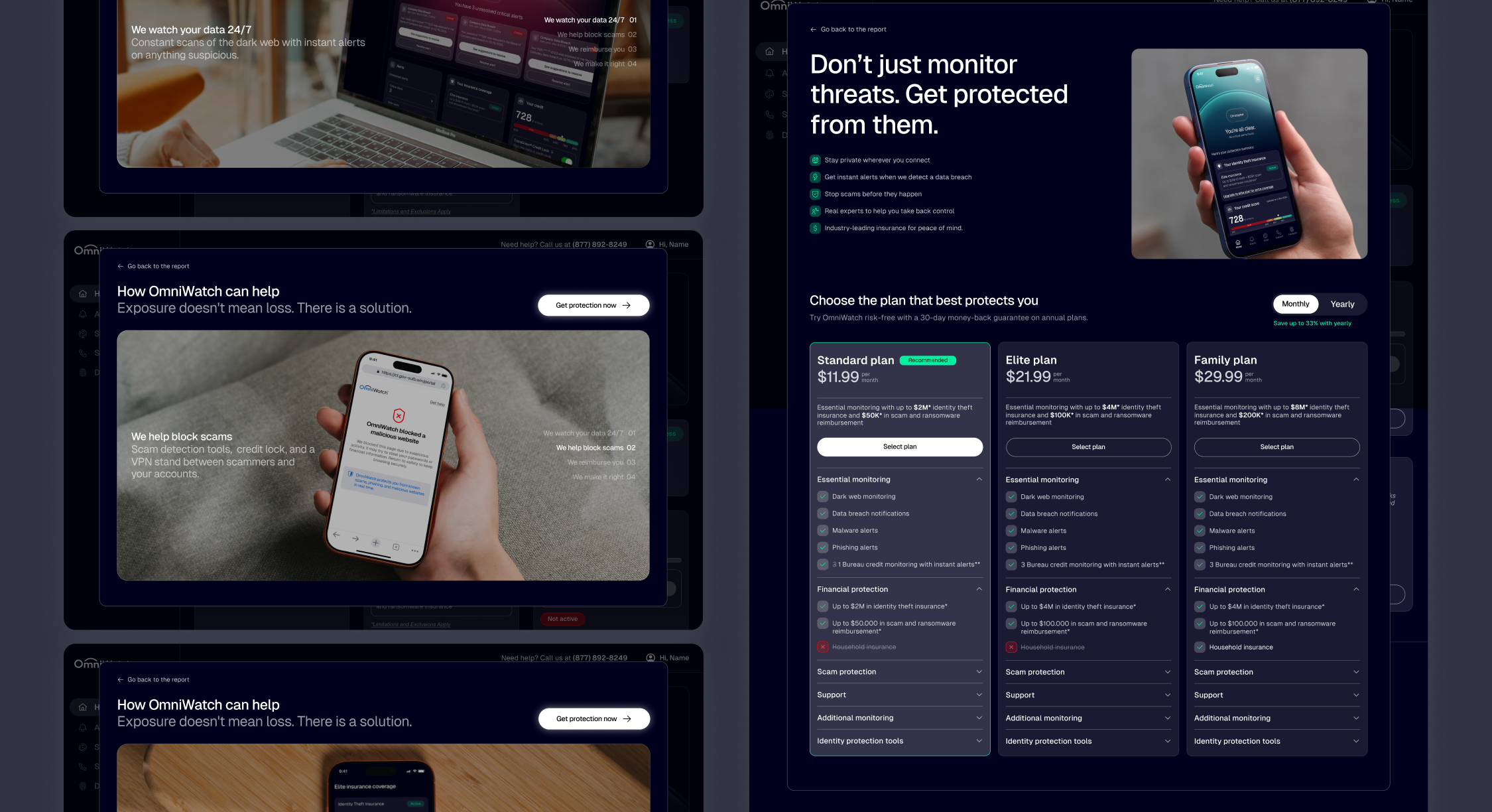
03 — Turning security into peace of mind.
Most people weren't looking for an identity protection service because they didn't realize they had a problem. Before explaining why OmniWatch was the right solution, we first needed to help users understand why they needed one at all.
Description
As OmniWatch evolved, we identified a growing disconnect between what the product communicated and what users actually needed. The experience relied on protection scores, alerts, and technical information, but it didn't clearly answer the question users cared about most: “Am I protected?”
To better understand user expectations, I conducted 12 interviews with users of competing identity protection services. The research uncovered several insights that fundamentally changed how we approached the product experience.
The resulting redesign was later validated through user testing, which confirmed that the new status-based approach made users feel more confident and helped them immediately understand whether they were protected or needed to take action.
Learning 1: Users didn't need to actively use the product
One of the strongest insights from the interviews was that users didn't expect to regularly interact with their identity protection service. They wanted it to work quietly in the background, notifying them only when something truly required their attention.
This shifted our definition of success. Rather than encouraging users to spend more time in the product, the experience needed to provide confidence that everything was under control without requiring constant interaction.
Learning 2: Protection needed to be instantly understandable
The existing experience relied on a protection score that combined different product features into a single number. While technically accurate, users struggled to understand what the score actually meant or whether they needed to take action.
Instead of asking users to interpret a score, we redesigned the experience around two simple states: Protected and Action Needed. The goal was to answer the question users cared about most at a glance, removing unnecessary complexity from the experience.
Learning 3: Reassurance should turn into urgency when necessary
Creating a reassuring experience didn't mean hiding problems, it meant making the difference between being protected and being at risk immediately obvious.
When no critical threats were detected, the experience used a calm visual language, subtle animations, and simplified messaging to reinforce that users were protected. When a critical alert appeared, the interface shifted to a distinct alert state that immediately communicated urgency and guided users toward the appropriate next action.


04 — Improving Product Activation Through Onboarding.
We continuously refined the onboarding experience to reduce friction, improve activation, and help users understand the value of their subscription from the very first interaction.
Description
While the acquisition funnel successfully converted visitors into customers, activation remained a critical challenge. The onboarding experience became the first opportunity to help users understand the value of their subscription, configure the product, and build confidence in the protection they had just purchased.
Through continuous iteration, user testing, and behavioral analysis, we refined the onboarding to reduce friction, communicate value more effectively, and help users reach their first meaningful experience as quickly as possible.
Learning 1: Interactions don't always communicate what we intend
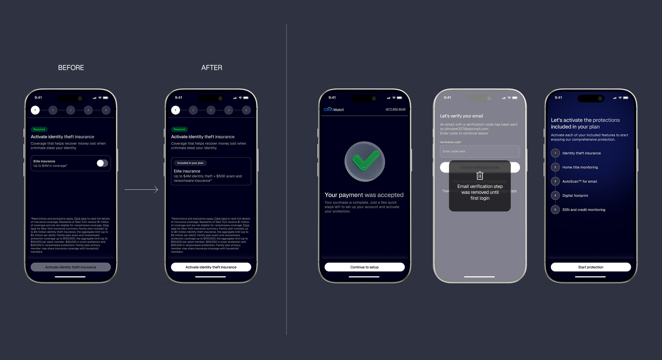
One of our goals was to make users feel they were actively enabling the protections included in their subscription. To reinforce this idea, I designed each onboarding step around a toggle, allowing users to “turn on” features such as identity insurance or monitoring.
The concept seemed intuitive, but user testing and activation metrics revealed the opposite. Many users interpreted the toggles as optional add-ons or premium features that required an additional purchase, creating uncertainty instead of confidence. We removed the toggles and redesigned the onboarding around confirmation rather than activation, making it immediately clear that these protections were already included in their subscription.
Learning 2: Every unnecessary step reduces activation
The original onboarding required users to verify their email immediately after completing their purchase. While this additional verification improved account security, it also interrupted the momentum users had built throughout the acquisition journey.
Behavioral data showed that a significant number of customers never completed this step, preventing them from reaching the product despite already having subscribed.
We removed the email verification from the initial onboarding experience, allowing users to access the product immediately and complete verification later. This simple change increased the activation rate from 56% to 89%, demonstrating how removing friction at critical moments can have a much greater impact than adding additional guidance or education.
05 — Making security alerts understandable and actionable.
User research revealed that customers weren't looking for more features. They wanted reassurance that everything was under control. These insights reshaped how we communicated protection throughout the product.
Description
As OmniWatch introduced a new alerting technology, the product needed to communicate a broader range of security events, each with different levels of severity, context, and recommended actions. So the challenge was to translate complex technical information into an experience users could quickly understand and confidently act on.
Working closely with the Product Owner and Engineering team, I helped define how these alerts should be prioritized, explained, and presented throughout the product.
Learning 1: Designing starts with understanding the technology
Before exploring solutions, I spent time with the Product Owner and Engineering team to understand how the new alerting technology worked, what information it generated, and what actions users would be expected to take.
This technical understanding became the foundation for every design decision, allowing us to organize alerts by severity, surface the most relevant information, and present recommendations that matched the underlying capabilities of the platform.
Learning 2: Technical accuracy doesn't guarantee user understanding
The engineering perspective focused on communicating everything the system knew. My role was to translate that information into an experience that users could easily understand without feeling overwhelmed.
We simplified the alert hierarchy, clarified the language, and designed each alert around three simple questions: What happened? Why does it matter? What should I do next?
This ensured the experience remained informative without requiring users to interpret technical security terminology.