YEAR
2022
ROLE
SENIOR PRODUCT DESIGNER, PROJECT MANAGER
Designing an E-Commerce Platform to Launch a New Vocational E-Learning Service
PROJECT OVERVIEW
Founded in 2009, Implika is a leading vocational training institution in Spain, dedicated to job placement and professional development. With over 20 training centers across the country, they equip students with the knowledge, skills, and mindset needed to succeed in their careers.
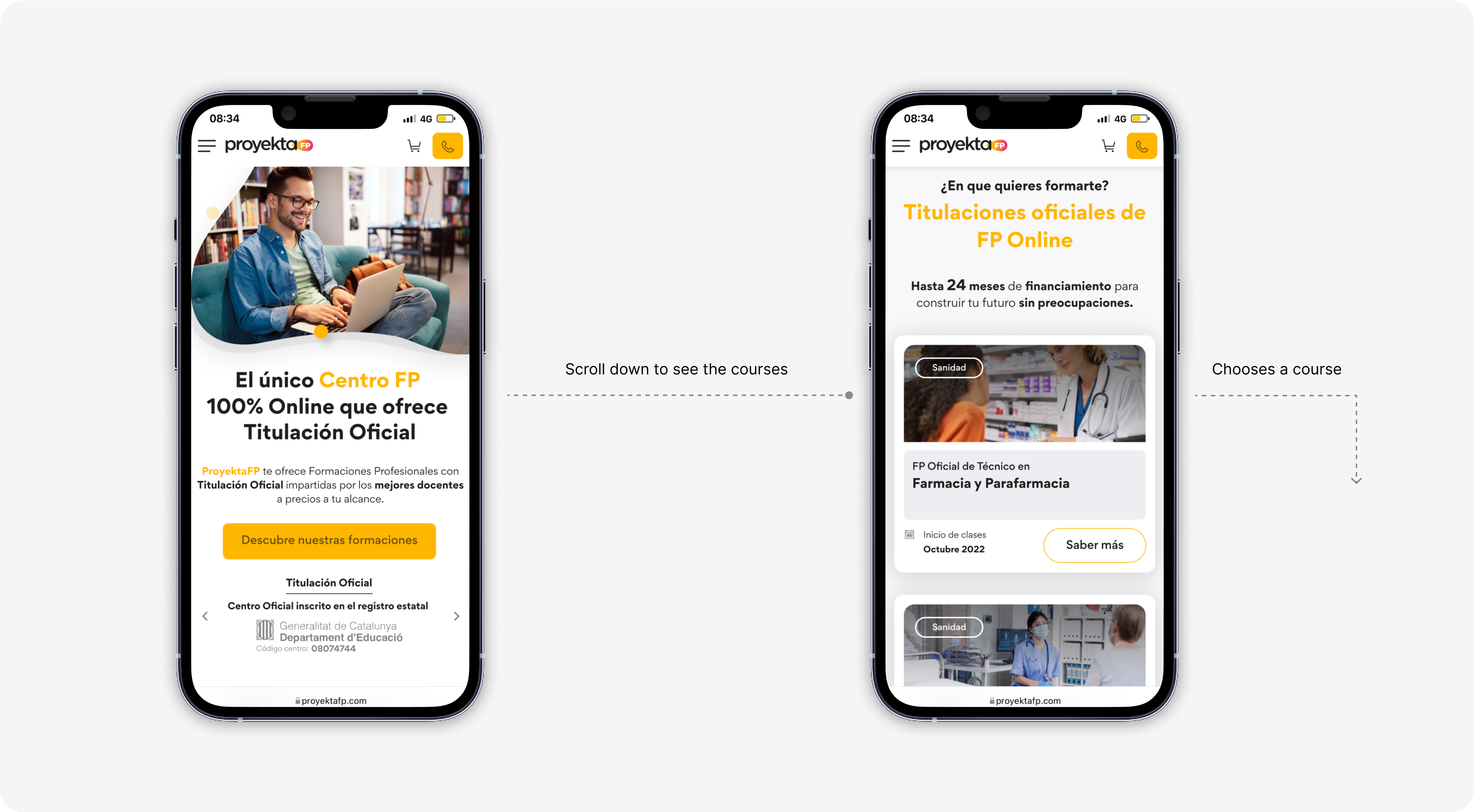
To expand access to their programs and meet the evolving needs of young learners, Implika launched ProyektaFP, an online training service. They needed a dedicated e-commerce website to market their courses, communicate their educational model, and attract new students.
The platform had to showcase all available courses with purchasing options while effectively conveying ProyektaFP’s value proposition. Additionally, a key focus was optimizing conversions, with the primary KPI being the number of enrolled students per semester.
CONTRIBUTION
As the Product Lead, I oversaw the entire 0-to-1 process, from initial concept to final implementation. I structured the project into strategic sprints, ensuring continuous collaboration with the client and delivering key milestones at each phase.I facilitated user testing sessions to validate the design and refine the user experience.
Additionally, I created comprehensive handoff documentation for developers and conducted a QA review to ensure the final implementation aligned with the intended design and functionality.
Additionally, I created comprehensive handoff documentation for developers and conducted a QA review to ensure the final implementation aligned with the intended design and functionality.
PROCESS


DISCOVER
Defining user needs and business objectives
Our first priority was to deeply understand the needs and behaviors of students in vocational education. We explored key questions such as:
- How do young people approach studying today?
- What barriers contribute to dropout rates?
- How can we help them balance education with work?
By aligning these insights with the capabilities of ProyektaFP, we defined the essential features the website should offer to maximize engagement and accessibility. Additionally, we established the core business objectives and KPIs to measure and optimize the platform’s success over time.

INFORMATION ARCHITECTURE AND USER FLOWS
Designing Navigation to Drive Conversions and Simplify Information Discovery
We started by defining the website's information architecture, ensuring that all key features were structured to make information easily accessible. Once validated with stakeholders, we shifted our focus to user flows, mapping out different actions users could take to achieve two main goals: optimizing key performance indicators (KPIs) and creating a seamless, intuitive experience that gave users a sense of control.
To align the architecture and flows with the company’s strategic approach, we conducted multiple stakeholder reviews, leading to essential iterations that refined the final structure.
To align the architecture and flows with the company’s strategic approach, we conducted multiple stakeholder reviews, leading to essential iterations that refined the final structure.

BEHAVIORAL DESIGN
How we persuade users to optimize business results.
When designing a product, it’s essential to not only meet user needs and create a positive experience but also drive conversions. In this case, the primary success metric was the number of courses purchased on the website.
To achieve this, we leveraged Behavioral Design principles, applying persuasion techniques in an ethical way to guide users toward desired actions.
We began by identifying potential barriers that could prevent users from completing the enrollment funnel. What doubts might they have? What could make them hesitate? At the same time, we highlighted the product’s most compelling aspects to reinforce motivation and drive enrollment.
A key part of this strategy involved applying cognitive biases, predictable patterns in human decision-making that influence behavior. Since our brains process information in systematic yet often unconscious ways, understanding these tendencies allowed us to design experiences that subtly encourage action.
Below are some examples of how cognitive biases were integrated into the final design.


PROTOTYPE
From Wireframes to Final UI: Iterating Through User Testing
We began by designing low-fidelity wireframes based on the defined user flows and identified opportunities. The goal was to validate the page structure and core features with Implika, ensuring alignment before moving forward. After multiple iterations and stakeholder discussions, we refined these into high-fidelity wireframes, which we tested with real users.
Our primary objective was to evaluate the user experience, specifically, how easily users could find their desired course and complete the enrollment process. These tests revealed key pain points, particularly in the checkout funnel, where we identified friction that could impact conversions. As a result, we streamlined the process by breaking down complex form fields into progressive steps, surfacing more demanding inputs later in the journey to reduce initial friction.
Finally, we focused on UI design and aesthetics, creating a high-fidelity, interactive prototype that closely simulated the final experience.


DATA
Measuring results for continuous optimization.
As previously mentioned, our success was measured by the impact on KPIs. Once the website was live, we worked with Implika to track critical user data, including visitor traffic, funnel initiation rates, and actual course enrollments.
To further optimize conversions, we developed a Conversion Rate Optimization (CRO) plan, proposing a series of A/B tests to experiment with different design and content variations. The goal was to identify the most effective changes and implement those that led to measurable improvements.
Many companies view product launch as the finish line, but in reality, optimization is an ongoing process. Continuous iteration based on real user data ensures that the experience evolves and improves over time, because there’s always room for enhancement.
Proposed A/B test: Testing Modular Course Purchases for Business Impact
A key aspect of ProyektaFP’s value proposition was allowing users to purchase individual course modules instead of full programs. This approach had the potential to lower the entry barrier, making enrollment more appealing due to reduced upfront costs. However, we needed to determine whether this flexibility would lead to higher overall conversions or negatively impact total revenue.
To evaluate its business impact, we conducted an A/B test measuring the total revenue generated through purchases. This experiment helped assess whether modular pricing encouraged more enrollments or if full-course purchases remained the more profitable model.
To evaluate its business impact, we conducted an A/B test measuring the total revenue generated through purchases. This experiment helped assess whether modular pricing encouraged more enrollments or if full-course purchases remained the more profitable model.
Variant A
Full program as default

Variant B
Modules as default

Proposed A/B test: Optimizing the Checkout Process: Single vs. Financed Payments
The checkout experience plays a crucial role in driving conversions, particularly at the payment step, where users may hesitate before completing their purchase. To determine the most effective approach, we tested the two variations below.
The objective was to assess how each approach impacted conversion rates and total revenue, as well as whether introducing financing earlier or later in the flow influenced user decisions. By tracking checkout completion rates and average transaction value, we gained insights into which strategy maximized enrollments while ensuring a sustainable business outcome.
The objective was to assess how each approach impacted conversion rates and total revenue, as well as whether introducing financing earlier or later in the flow influenced user decisions. By tracking checkout completion rates and average transaction value, we gained insights into which strategy maximized enrollments while ensuring a sustainable business outcome.
Variant A
Financed payment plan

Variant B
Single upfront payment

Results and main conclusions
The launch of the new website had a significant impact on Implika’s digital training business. Within the first year, revenue increased by 29%, demonstrating the success of the platform in driving enrollments. Client satisfaction was extremely high, reinforcing the value of the work delivered.
However, despite these positive outcomes, there were key areas where the project could have been further improved:
- More Detailed Functional Documentation: Some features were not implemented as intended due to ambiguities in the documentation. For instance, the incorrect use of commercial banners in the hero section could have been avoided with clearer specifications.
-Deviation from Design During Development: The ProyektaFP development team did not fully adhere to the approved designs. While an initial QA review was conducted, they opted not to continue with further iterations. As a result, some pages contain usability issues, such as the course page with a double sticky request information button, which negatively impacts the user experience.
- Missed Opportunities for Further Optimization: Although we proposed additional A/B testing to refine conversion rates, these optimizations were not implemented. This leaves a significant margin for improvement, particularly in maximizing enrollments.
While the project was a clear success in terms of business results, these learnings highlight the importance of documentation, continuous QA, and iterative optimization in ensuring long-term performance.